In another post we handled your manager’s request using Linear Regression in Python. Your manager is also a Spark lover and she wants you to conduct the analysis in PySpark. How would you do it?
The process is pretty similar, other than a few lines of code.
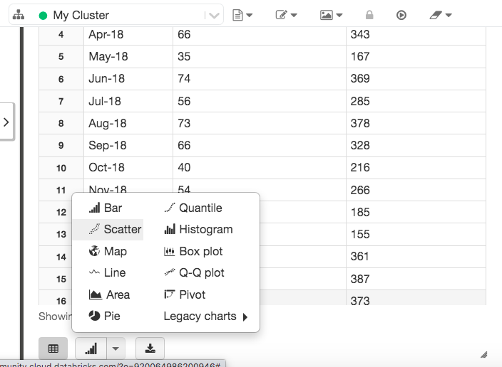
First let’s import the data.
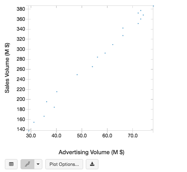
Note by using the ‘display’ function in the PySpark instance (such as Databricks), I can easily change the display table to a scatter chart.
Now let’s use VectorAssembler to transform the features column (Advertising Volume) into a vector.
Then we can conduct a linear regression modelling, and print the results.
Based on the regression results, we also get the below formula:
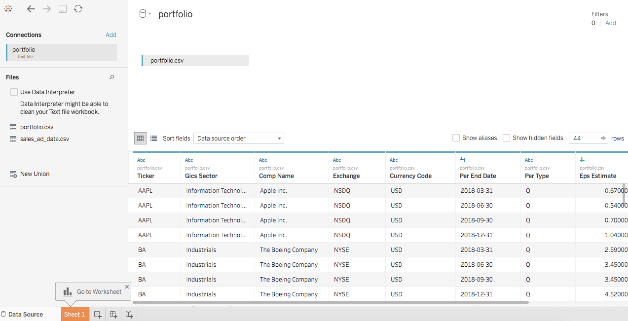
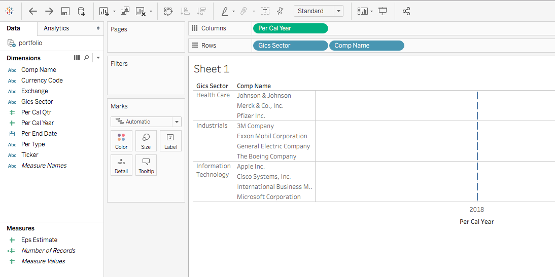
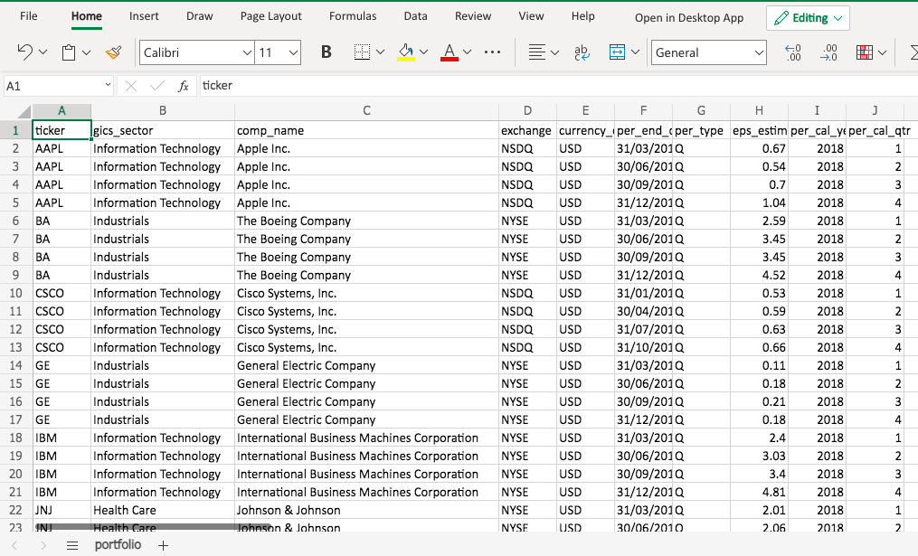
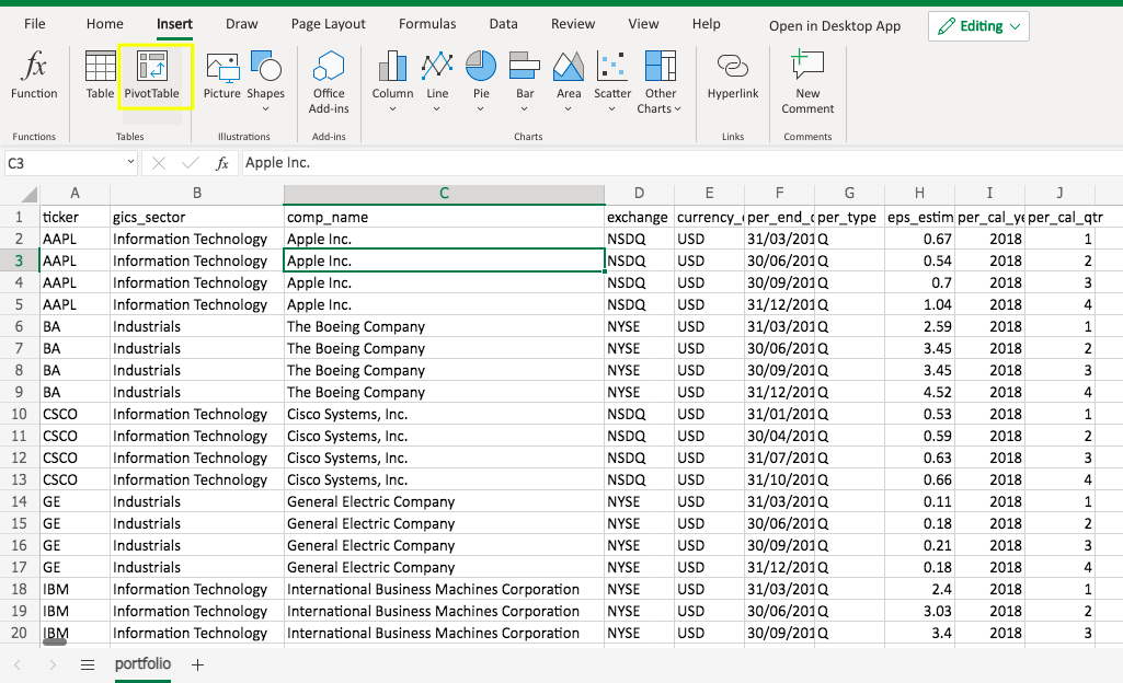
You are a portfolio analyst at an Investment company. Your manager gave you a dataset and asked you to conduct a few tasks to answer a few questions. How would you handle it?
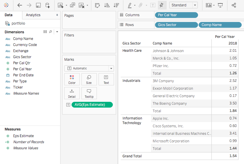
Provide a summary of the portfolio. What sectors does the portfolio cover?
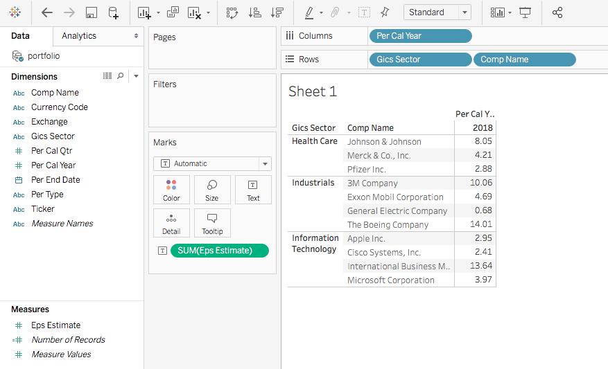
For a specific fiscal year, what is the average EPS (earnings per share) estimate for each stock?
What is the average EPS estimate for each industry sector?
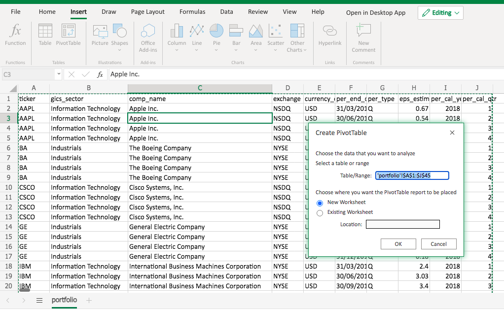
Pivot table enables analyst to quickly summarize data.
To create a pivot table, click any cell in the data source range. Go to Insert -> Pivot Table.
A pop-up will give you the default data source range to edit and ask you whether to create the pivot table on a new sheet by default. Simply click OK.
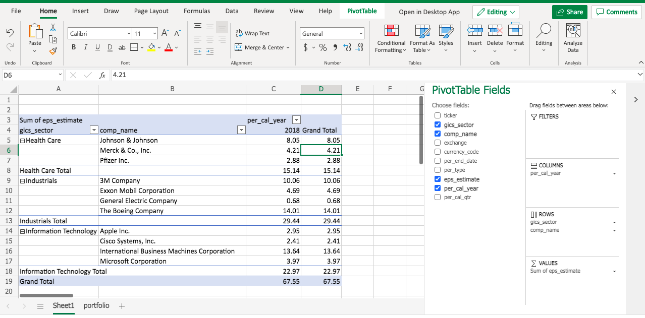
Then you will see a new sheet created, with a blank pivot table and the pivot table field list.
Now drag the gics_sector and comp_name to the ROWS area, per_cal_year to the COLUMNS area, and eps_estimate to the VALUES area. You will get an initial version of pivot table.
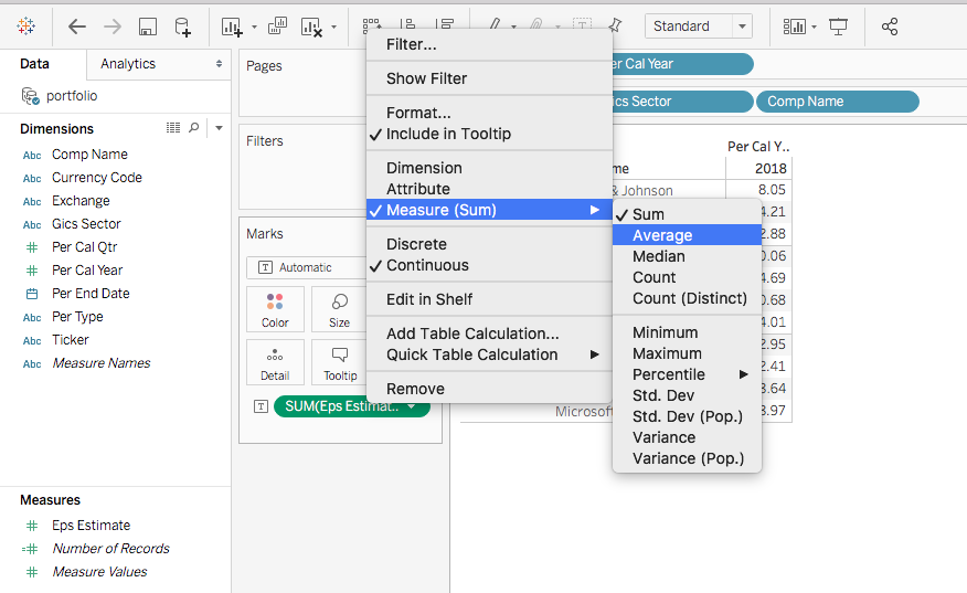
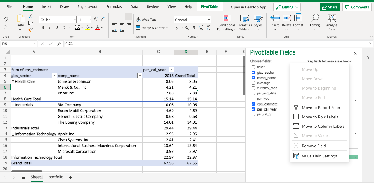
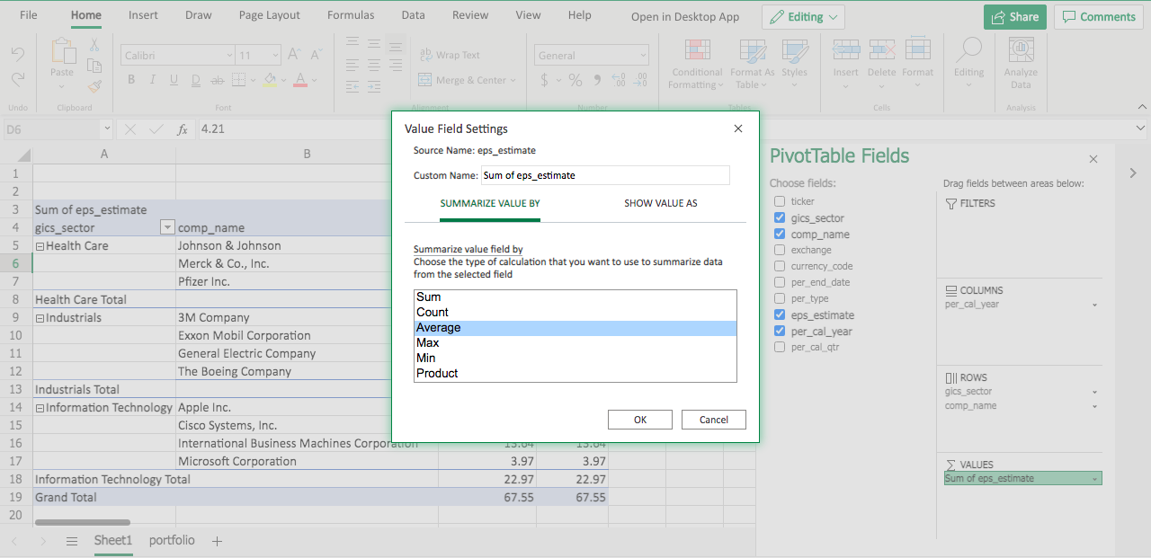
Note in the VALUES area, eps_estimate becomes Sum of eps_estimate. That’s the default function when we aggregate values. Let’s modify the function by clicking the triangle dropdown.
Under SUMMARIZE VALUE BY, select Average, and click OK.
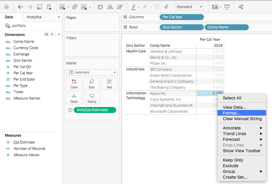
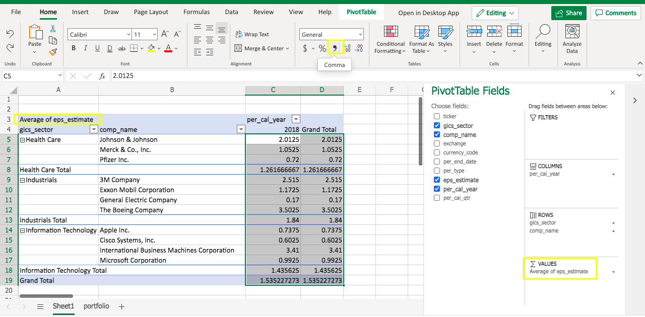
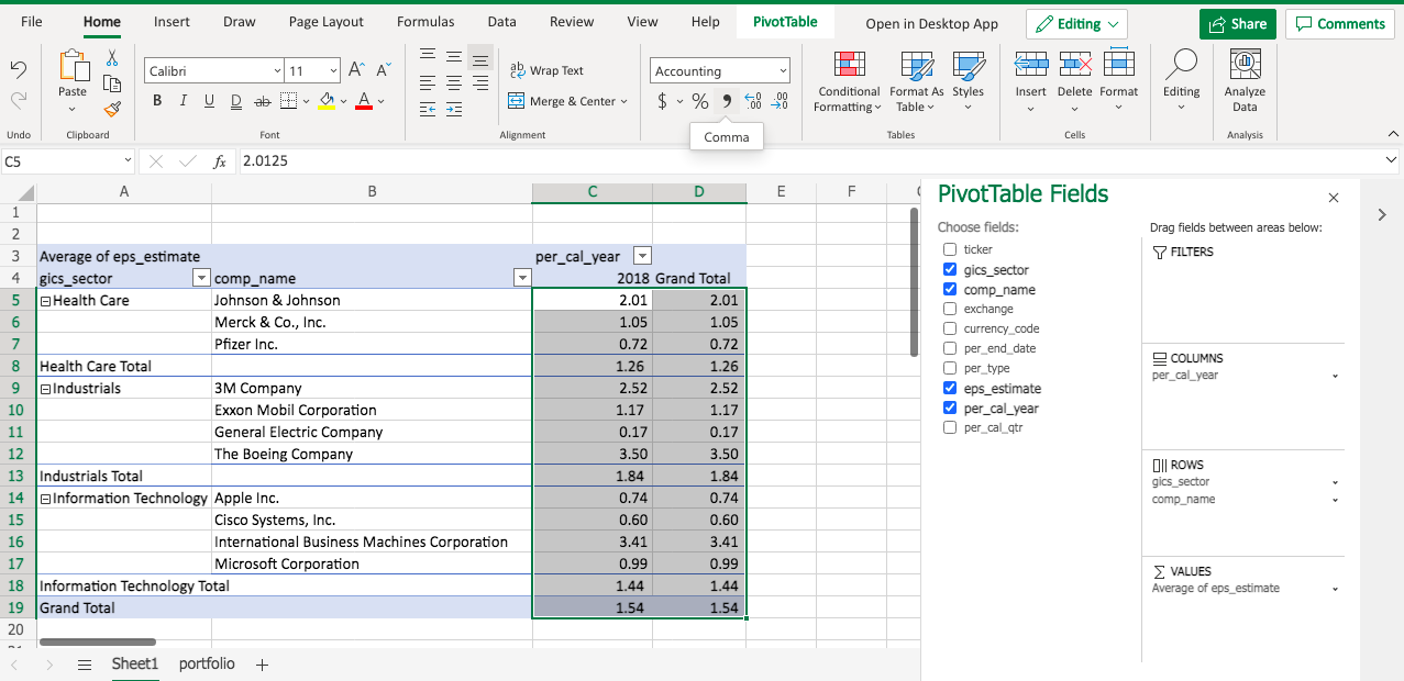
Then you will see the eps_estimate is displayed as the Average now. Note the number format isn’t standardized. To adjust it, one quick way is to select the value cells range, and click the comma sign.
As a result, the average eps_estimate will be displayed as 2 digits.
Now you pretty much have your pivot table ready, and you should be able to answer your manager’s questions.
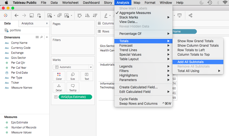
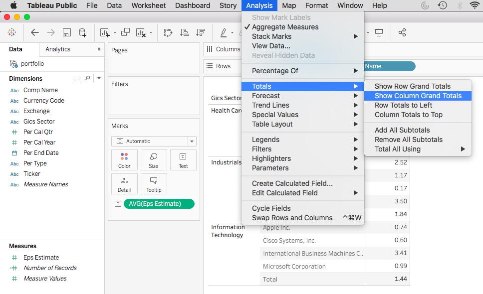
So far we’ve conducted a simple linear regression in Excel, Python, R, Tableau and SAS. You can see that different tools can do similar things.
However when doing data analysis in general, what are the differences between these tools, other than the code, or the UI? Below is a comparison of the PROS and CONS of each tool.
Tools
PROS
CONS
Excel
Easy to use, no coding required
Data size limitation – usually under 1 million records
Python
Can handle big data; open source, super popular
Need some coding
R
Can handle big data; open source, very popular
Need some coding
Tableau
Easy to use, can handle big data; great visualization, user interactive; no coding required
License can be expensive (unless using Tableau Public, which has limited features)
SAS
Can handle big data
Need some coding. License can be expensive (unless using SAS® OnDemand for Academics)
You will make your judgement when adopting data analysis tools to solve business problems.
In previous post we handled your manager’s request using Linear Regression in Tableau. Your manager also loves SAS and she would like you to conduct the analysis in SAS. How would you do it?
The process very similar, other than the running environment, and a few lines of code.
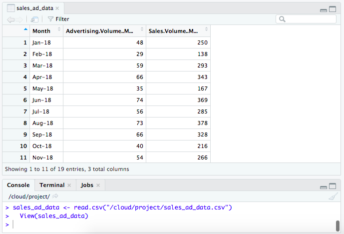
First let’s import the data.
Below is the import results.
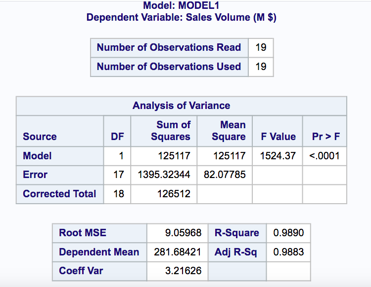
Then we can use the powerful PROC REG command.
You will get a very detailed summary report.
Based on the regression results, we also get the below formula:
In last post you handled your manager’s request using Linear Regression in R. Your manager is a big fan of Tableau and she would like you to present the result in Tableau. How would you do it?
The process is very easy, with no coding required at all.
First let’s import the data.
Then we go to the worksheet, drag Advertising Volume to the Columns Shelf, and Sales Volume to the Rows Shelf. We also drag Month to the Marks. A scatter plot has been created.
Now go to Analytics beside Data, double click Trend Line. A trend line will be added. If you hover the mouse over the trend line, you will find the model formula: Sales Volume (M $) = 5.02705*Advertising Volume (M $) + 0.433718.
Right click the trend line you see the option of ‘Describe Trend Model’.
Click ‘Describe Tend Model’ then you will get a pretty informative model summary, similar to what you get using other tools (Excel, Python, R, etc.)
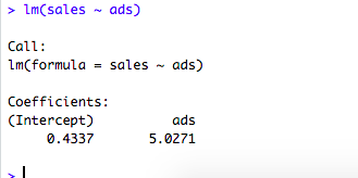
In previous post we handled your manager’s request using Linear Regression in Python. Suppose your manager also would like you to conduct the analysis in R. How would you do it?
The process is again very similar, other than the running environment, and a few lines of code.
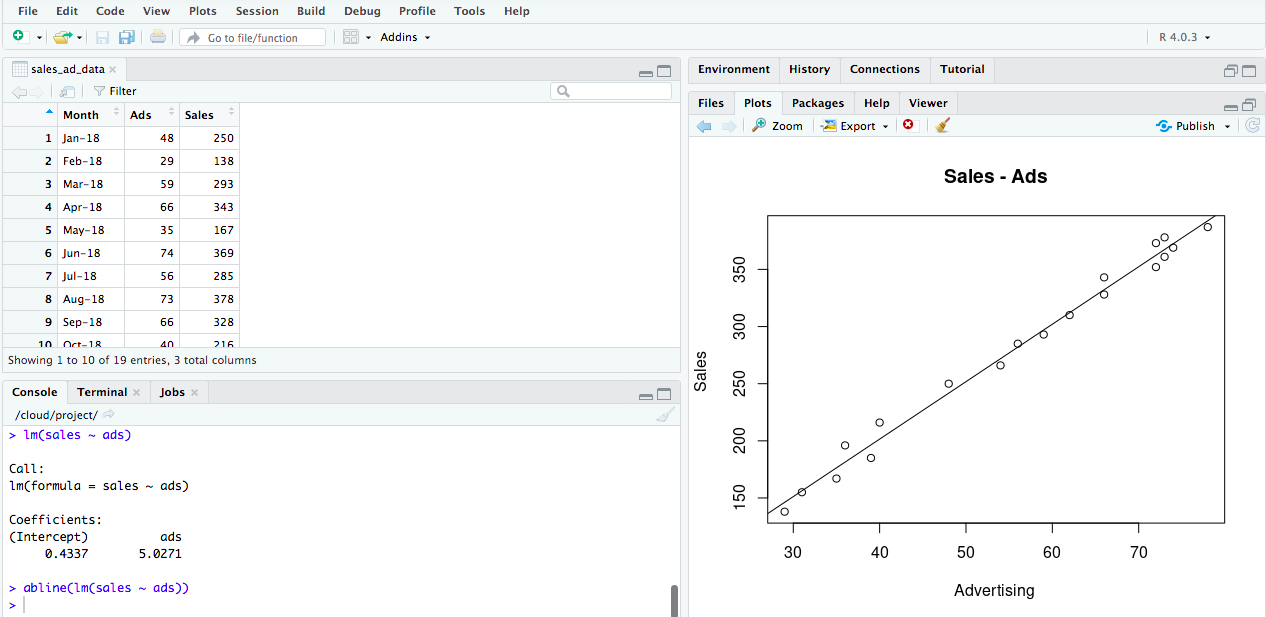
First let’s import the data.
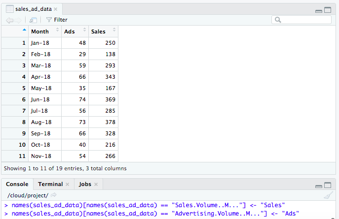
Note the column names are a bit unfriendly. Let’s rename them.
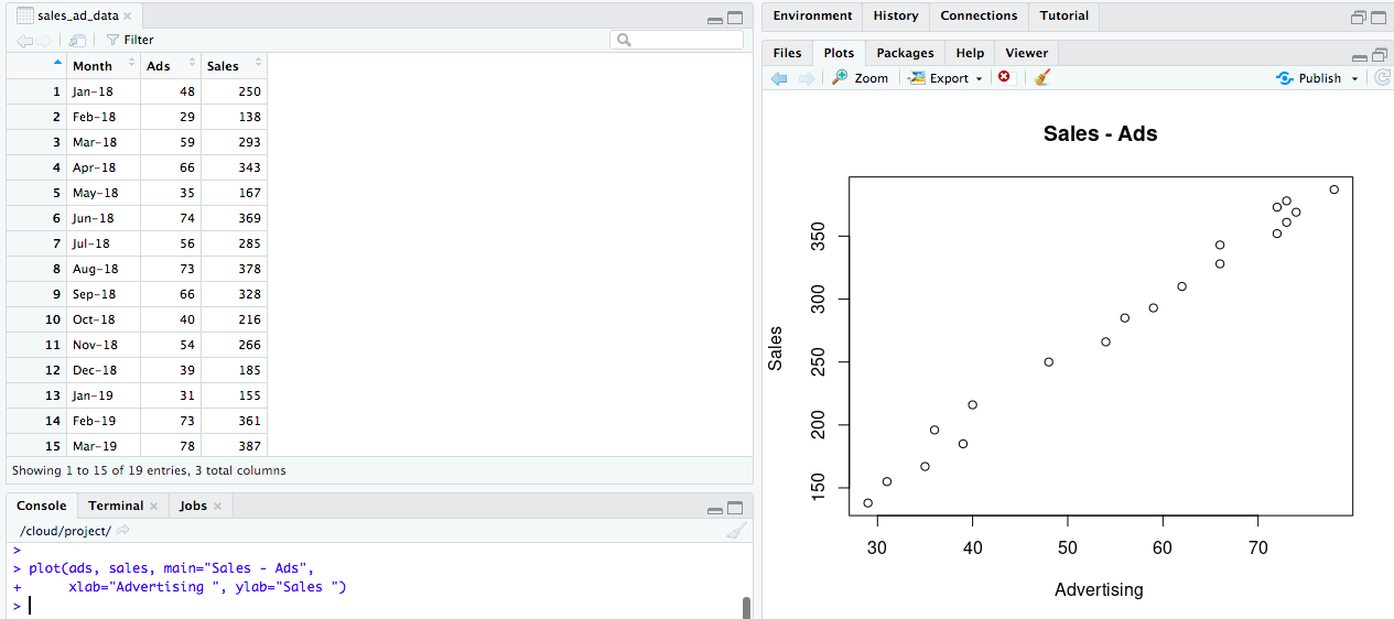
Then we’ll do a quick scatter plot.
Now let’s print the slope and the intercept.
And we will add the Line Fit to our Plot.
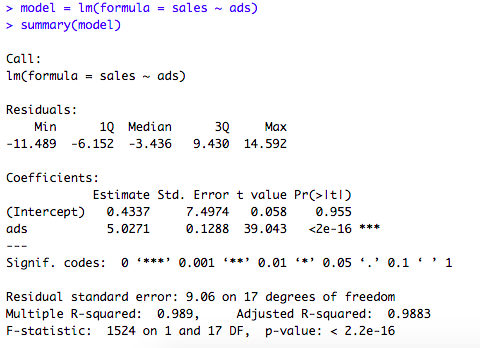
If you want a detailed summary output (similar to Linear Regression in Python), you can do below.
Based on the regression results, we also get the below formula:
In another post we handled your manager’s request using Linear Regression in Excel. Your manager is a Python lover and she wants you to conduct the analysis in Python. How do you do it?
The process is pretty similar, other than the running environment, and a few lines of code.
First let’s import the data.
Then let’s do a quick scatter chart.
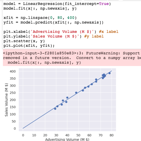
Now let’s do a Line Fit Plot.
And we will print the slope and the intercept.
If you want a detailed summary output (similar to Linear Regression in Excel), you can do an OLS below.
Based on the regression results, we also get the below formula:
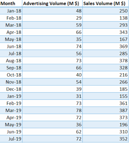
Your manager asked you to predict next year’s sales numbers for your company. She suggests you to analyze sales and advertising volume. What methodology will you use?
In statistical modeling, Regression is used to determine the strength of the relationship between two or more variables.
Dependent Variable: the variable that you want to predict
Independent Variables: the variables that may affect the dependent variable
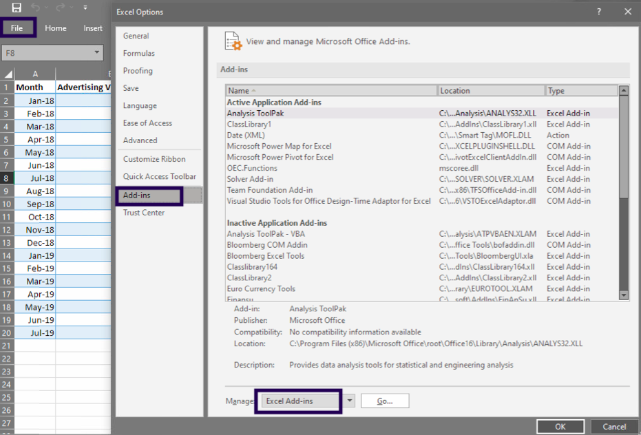
Conduct Regression Analysis in Excel:
In your Excel, click File > Options.
In the Excel Options dialog box, select Add-ins on the left sidebar, make sure Excel Add-ins is selected in the Manage box, and click Go.
In the Add-ins dialog box, tick off Analysis ToolPak, and click OK:
This will add the Data Analysis tools to the Data tab of your Excel ribbon.
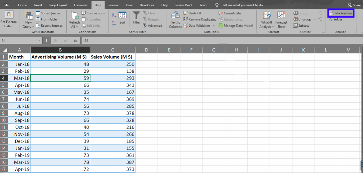
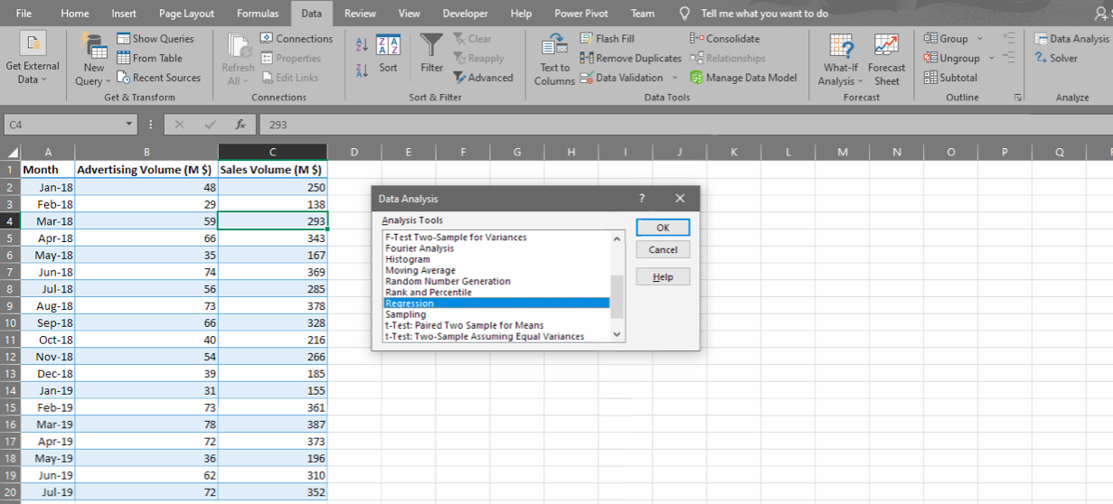
Now click any cell in the data range, go to Data -> Data Analysis. Look for Regression, click OK.
Pick the range for the dependent variable (Y) and the independent variable (X).
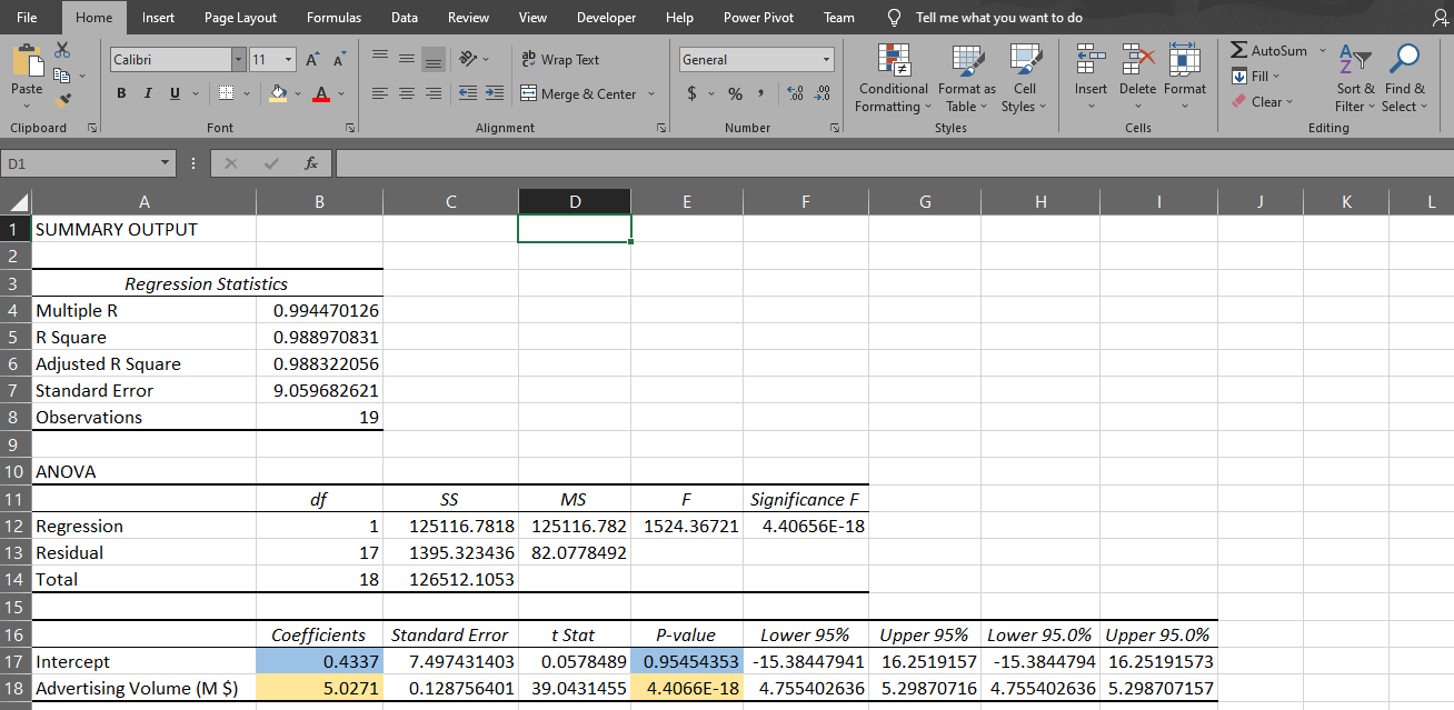
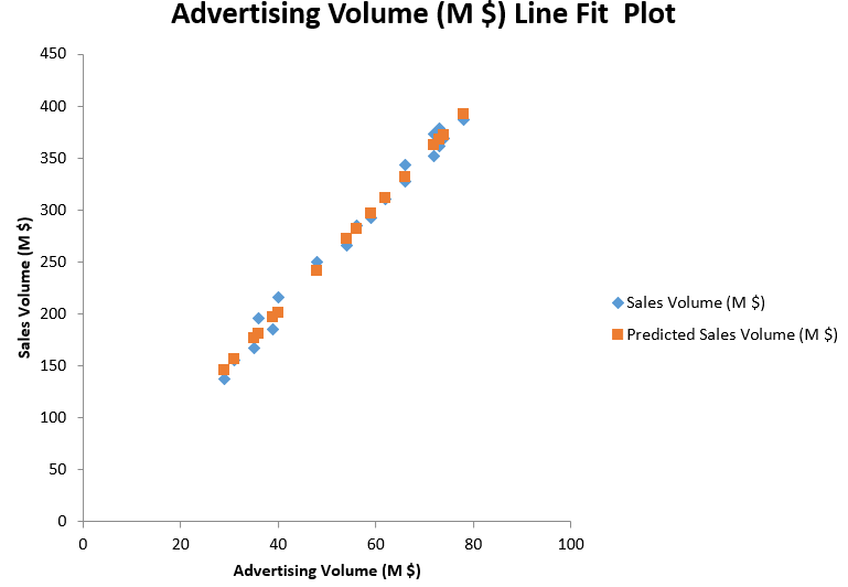
Then you will get a very informative summary output, as well as a Line Fit Plot.
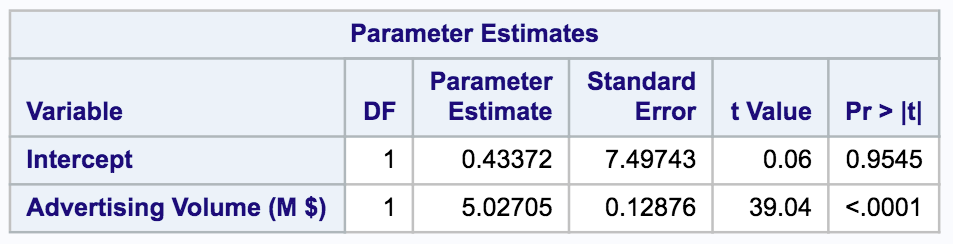
Based on the regression results, we get the below formula:
Sales = 0.43 + 5.03 * Advertising
0.4337 is the intercept coefficient, and 5.0271 is the coefficient for advertising volume. This tells us that when advertising volume increases by $1000, sales volume will increase by around $5027.
Note the p-value for the two coefficients. A p-value lower than 0.05 indicates the result is significantly different from 0. In this case, the intercept (with p-value of 0.95) is not significantly different from 0. However, the coefficient for advertising (with a p-value under 0.05) is significantly different from 0.
We conclude that there is a strong relation between sales volume and advertising volume.
Suppose now your manager wants you to conduct the regression analysis in Python. How will you do it? Watch the next post – Linear Regression in Python.